
Wednesday, 29 September 2010
Page 1 - Getting His Wings

Edgyness
The thought crossed my mind, how can i make this zine a bit more edgy and daring in its context. Maybe i didn't need to actually say the main protagonist is a mayfly, maybe its up to the audience to make that conscious link. Maybe i could create a zine that seemed to be from the view of a human, but was actually that of a mayfly. This could emote some sort of reaction with the viewer. If they had 24 hours to live, would they do the same? I know a lot of people who if you ask "if you had 24 hours to live what would you do?" their answers would be along the lines of have fun, shag as many people as i can, go mental. But if they could look back and do it differently, these events would surely change because of the guilt and the desire to use that 24 hours a bit better. I wanted to make it so the zine seemed as if the protagonist had human thoughts, human wants, and through this i could make the pages that bit more controversial, more daring.
Front Cover
So the general style i want to use is taking influence from all that ive looked at so far. distorting image but not so they are unrecognisable, using blocks of image or colour aswell as keeping everything in a grid, yet still fairly chaotic, fearless type.
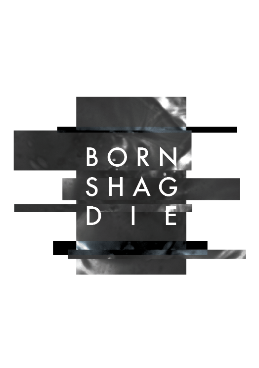
 The images i've used as the section are photos i took ages ago for another project of oil in water. They work really nicely with the font, this being futura. Linking back to carson, ive changed the tracking so all words fit within a box snug, so the tracking differs with each word. Again, theres a grid structure, but one that allows me to make the whole image un-symmetrical.
TITLE!
I've messed around with a couple of zine title ideas but most of them were generic and bland, i.e. what would you do in 24 hours or spend it differently. But i want it a tad shocking, a blunt statement that punches you in the face metaphorically. Going back to the 3 stages of its life. Born, Shag, Die. Thats its life, its sole purpose as its adult form is to come of age, fuck misses mayfly and bugger off to mayfly heaven, all within 24 hours. So the title for my zine will be that, Born, Shag, Die. To the point, blunt, outline of the zine.
The Outcome
The theme i've chosen is in itself some kind of a story, so maybe i could portray that story in a series of pieces of artwork or a small zine. Each of the pages would be a significant part within the mayflies life and each page would act as its own piece of artwork aswell. Again the artwork i want to be subjective, suggestive and edgy, something thats quite shocking but not in a "look its a vagina!" kind of way.
David Carson Never Gets Old
So i've looked at his work endless amounts of times but its so influential in my work i have to mention it. Fearlessness, to not be afraid of breaking the rules then giving them the finger as you pass by. His typography sometimes now looks dated, but the core principles of experimental typography are still very useful to take away. The principles? Don't be restrictive, don't play it safe and don't always give the audience an easy time. Good typography engages viewers, whether its legible or not. This is an area i definitely want to explore with my outcomes.


Misery Signals CD Design
So i generally despise the stereotypical design that goes hand in hand with "metal music". I pride myself on being very diverse in my music taste and so come across loads of decent album designs, but ones that strike out to me are ones that dare to be different to the genre they are labeled with in HMV. So i'm browsing the metal section wearing my topman clothes and getting stares of dudes in leather trenchcoats, generally looking for decent cds. Never heard of them before, dont overly like them, but the CD artwork for this band was actually really nice from a design point of view and a big f**k you to stereotyping. No skulls, no blood, no crosses, just nicely designed pieces of artwork, that can be linked back to Andy Denzlers work. The lines of distortion crossing an image are used here, just like the paintings and although i doubt each was based on each other, these links are there and similar ideas have been put into practice, but in completely different formats and for a completely different demographic. This disregard for boundaries is what makes this for me a special piece of design.


Subscribe to:
Posts (Atom)